Dark mode isn’t a personality
Our site is nearly pure black. We're aware of how this is going to sound.
Let’s get the awkward part out of the way: our website is nearly pure black. Black background, white type, no color to speak of. There’s a light switch in the corner now, and we’ll get to it, but dark is still the default, the front door, the house style. So yes, we’re about to critique dark interfaces from inside one, like a man in a leather jacket warning you about leather jackets.
Stay with us. There’s a distinction worth making.
Sometime in the last several years, dark mode stopped being a display preference and became a costume. Want to look premium? Go black. Want to look technical? Black. AI startup, crypto exchange, streetwear drop, boutique agency, productivity app promising to change your relationship with Tuesday? Black, black, black, black, black. The palette that once signaled “we made an unusual choice” now signals “we looked at what everyone else chose.”
Which is fine, honestly. Trends are how visual culture breathes. The problem isn’t the color of the background. The problem is what happens when you ask why.
The why test
Ask a team why their site is dark and count the seconds. If the answer arrives fast and specific, you’re talking to people who made a decision. If it’s some arrangement of “premium,” “modern,” and “clean” delivered while looking slightly past you, you’re talking to people who made a Pinterest board.
A copied aesthetic and a real decision can look identical in a screenshot. The difference only shows up under pressure. The team that decided knows what the darkness costs, because every choice like this costs something. Long-form text is harder to read light-on-dark; thin white type halos and shimmers; photography with bright backgrounds arrives on the page like a flashlight to the face. If you went dark on purpose, you’ve already met these problems and paid for them somewhere. Go dark because everyone did, and the problems are still in the mail.
Our answer, since we opened this can
Here’s our answer to the why question.
We’re black and white because monochrome is a discipline. Strip out color and you lose an entire cheating mechanism. You can’t make the important thing important by making it orange. Hierarchy has to come from type, scale, spacing, and the nerve to leave things out, which means every layout decision happens with the lights on, so to speak. And when the work we show is the only color on the page, the work gets the whole room. Client projects walk into a black gallery, not a decorated one.
Also, and we can’t fully deny this: we’re named after a colony of barn owls. Some things you lean into.
Are those reasons objectively correct? No such thing. Another shop could weigh the same tradeoffs, land on warm cream and hand-drawn type, and be exactly as right as we are. The point was never that black is good.
“Why does it look like this” should have an answer longer than the question.
The switch in the corner
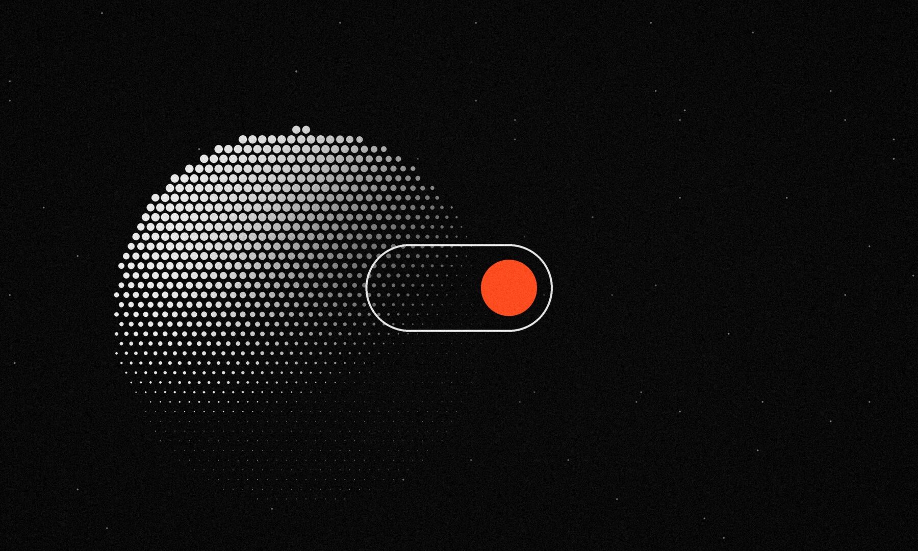
This summer we gave the site a light mode. Not because black stopped being us. Dark is still the default, and no operating system setting will argue us out of it. But “display preference” should mean the visitor gets a preference, so there’s a small sun in the corner of the navigation now, and flipping it keeps everything we just bragged about: same monochrome, same hierarchy, ink and paper trading places.
Here’s the detail that earns its spot in this post. Light mode wasn’t an inversion filter. The same typeface reads thinner as dark text on a light ground than it does as light text on a dark one; that’s a quirk of how screens render, not an opinion. So in light mode our headlines quietly gain a step of weight and the font smoothing changes, purely to keep the type sounding like the same voice. Nobody will ever notice, which is the point. That’s what a paid-for decision looks like: the cost shows up in details you’d never find unless someone told you where they were buried.
A small exercise, free of charge
Open your site. Open your site. Pick any visual decision: the dark background, the giant serif, the grain overlay, the cursor that trails little dots. Now explain it to an imaginary skeptic without using the words “premium,” “modern,” or “vibe.”
If you can, congratulations, that one’s yours. Keep it.
If you can’t, you’re not in trouble. You’ve just found the difference between a brand and a costume, which is a genuinely useful thing to find on a Tuesday. A costume is what you wear to look like someone. A brand is what’s left when the lights go out.
Ours happens to work in the dark. Owls usually do.